As interim lead I managed the UX/UI team, communicated consistently with many departments and stakeholders while conducting interviews for the head of UX role. On regular intervals I would meet with the key 3rd party technology platform to develop the conversational commerce and AI software to gain an understanding of how it can be best served to meet the users needs for the UK's No.1 provider of managed digital marketing services for all types of local businesses.
Notable KPI:
Significant traffic and revenue flowing through the platform
"I have worked with Kai a number of times now and I know if I need someone who will work to understand the customer and business needs swiftly, who will conduct thorough research, who will confidently walk around the office, introduce himself and find who he needs to speak to, who will work with boundless energy and have an excellent understanding of UX procedures, Kai will provide this.
In this role I needed Kai to manage the UX team as interim lead, to be more hands off than focused on production, to mentor members of the team, to evangelise UX/UI, work with the Product Leads, other department heads and stakeholders, interview candidates and ensure we were always up to date and moving forward.
I would recommend Kai anytime and I look forward to working with him again soon."
James Loar - Head of Consumer at Yell
Yell is the UK’s No.1 provider of managed digital marketing services for all types of local businesses. For over 50 years they have supported the marketing needs of local businesses across every industry and every region of the UK. Trusted by over 100,000 businesses they tailor make product solutions using their relationships with the leading players in the industry – including Apple, Facebook, Google, Microsoft to ensure their solutions are cutting-edge, using automation and machine learning to deliver the best returns.
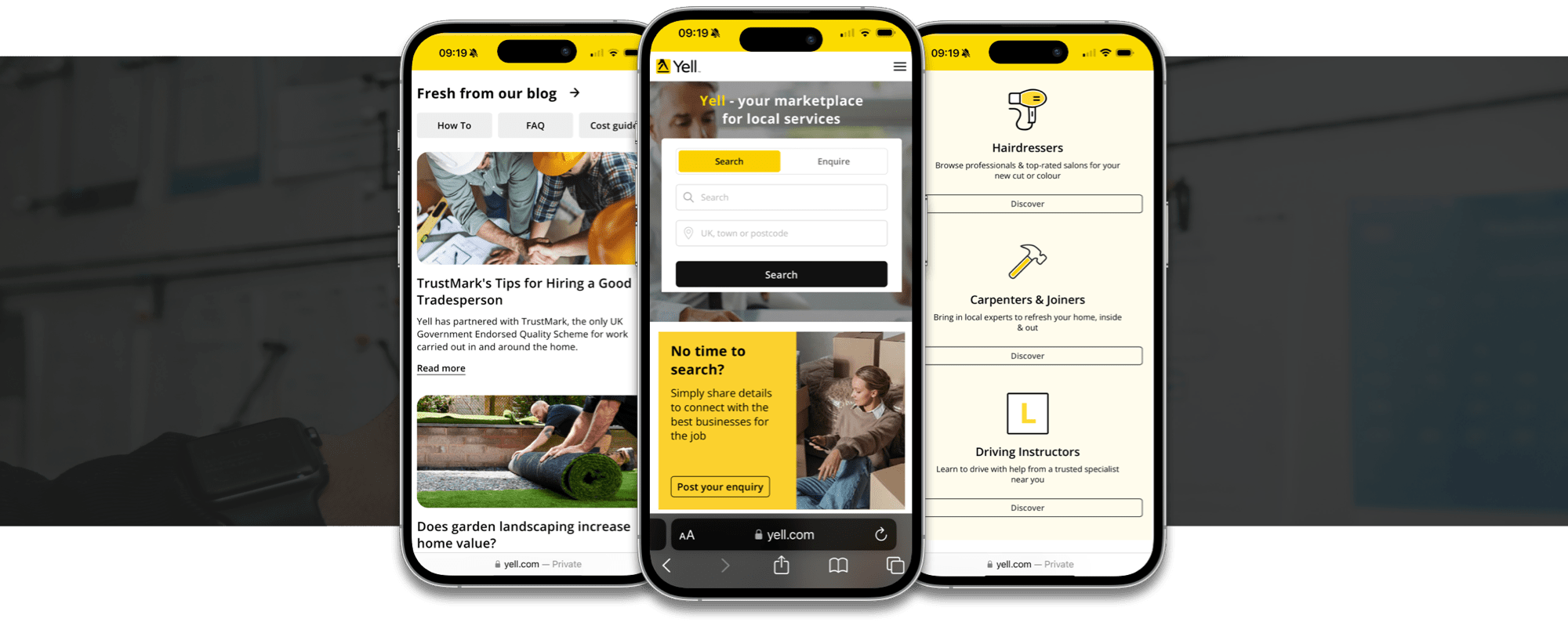
Yell was looking for ways to quickly and easily create a marketplace between its consumers (who had a need) with their businesses (who could service that need). They also saw an opportunity to embrace conversational commerce using Apple Maps and Spotlight search on iPhone and iPad.
The Chatbot using ‘Apple Business Chat’ (a powerful new way for businesses to connect directly with customers using iPhones, iPads, Macs and Apple Watches) would need to be able to handle thousands of conversations, guiding customers to the information they needed, and then finally handover to the merchant/business owner, who could then respond via the Yell Business app through their working day.
As with every UX project it’s essential to define and establish the Business and User goals as these are the foundational elements. From a meeting with the stakeholders I was able to ascertain both.
Business goal: Enable business owners to talk directly with customers via the Yell Messaging network once contact has been made, with a full understanding of their requirements.
User Goal: Connect with businesses after talking with ‘Hartley’ the Chatbot, ensuring a swift experience with all expectations met to keep customer retention and deliver a phenomenal customer experience.
With access to millions of businesses that were signed up with Yell we were able to gain valuable insights through web analytics for constructing personas and empathy maps to better understand our audience.
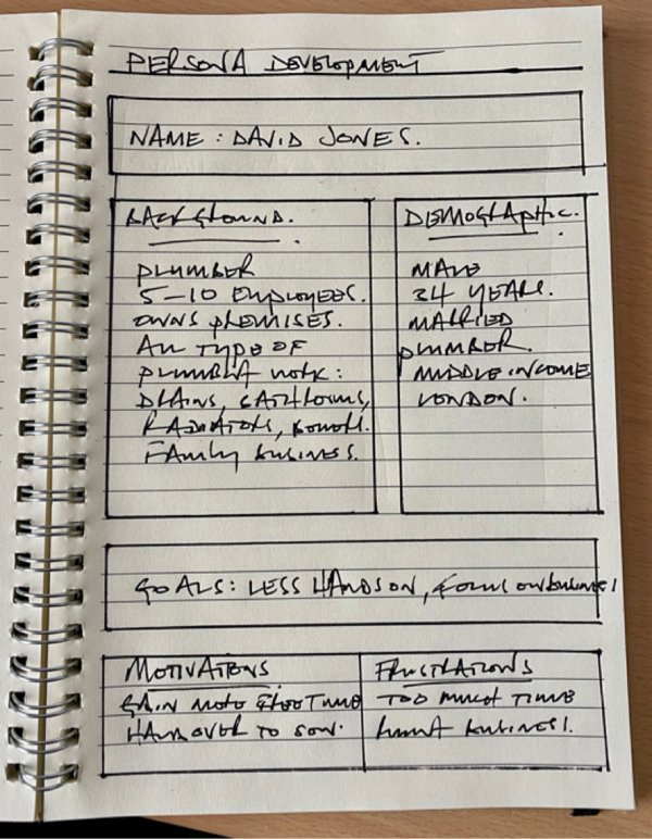
We were able to personify our audience/users/clients with their name, age, business type, geographical location and income. Using this information we were able to create and run 12 separate workshops around the UK with segmented demographics using stimulus material to understand where the pain points occurred, understand better the goals, motivations, frustrations and create stronger persona types to get a clear picture of our audience.
Due to sensitivity of data I am unable to show the findings.
To gain an understanding of how the Apple Business Chat software worked I had a series of questions I wanted to find answers for:
I researched who was currently using Apple’s Business Chat and then set myself a task on each determined by the nature of their business and proceeded through a set of questions to evaluate how well it worked for the user.
The main businesses I selected to learn about conversational commerce were:
I also looked at other conversational commerce examples that didn’t use Apple Business Chat including:
Overall across the board it worked very well. One business stated it only worked in the United States, some were very robotic, others had a touch of personality, using emojis and ending the conversation with ‘Have a nice day’. A few ended with surveys asking the user questions on their experience.

With an understanding of how others were using conversational commerce, I also researched articles to gain extra knowledge on how to approach designing and structuring a Chatbot's conversation. Jakob Nielson, the Nielson Norman Group www.nngroup.com, is one of my first ports of call for researched-based UX guidance that I more often than not find incredibly useful.
I came away with these findings which we added to our growing knowledge base on Chatbot conversations.

Given that we were new to the idea of designing a Chatbot's conversation, we had to start somewhere. We had gathered plenty of information and knew essentially what we wanted to achieve.
We had put together a hypothesis for how we imagined and perceived it should work, and how we wanted the bot to steer the conversation to meet our merchants and customers needs.
For us the main objectives were:
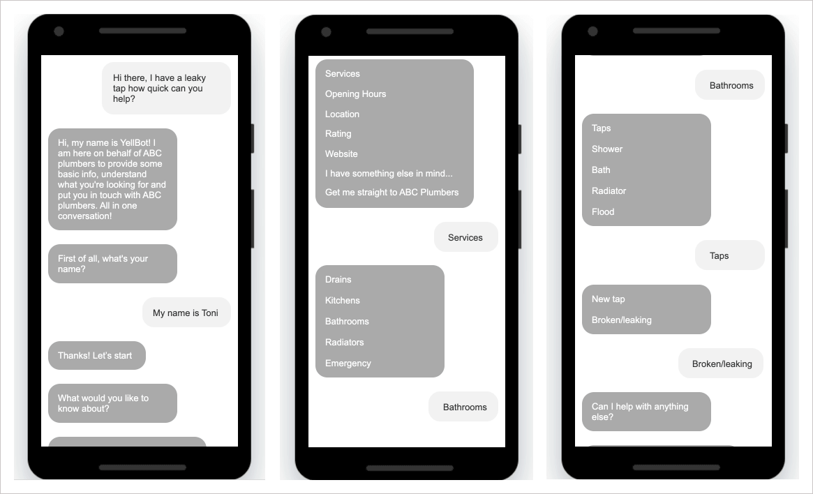
We decided to design two different journeys.
One journey that would take the customer down a successful path and the other down paths which weren't as straight forward. This would enable us to understand what we were trying to achieve and also show all the stakeholders our vision.
The 'happy' journey would show the customer entering the Yell app via Apple maps and then enter in a conversation with the Chatbot. From here we put together a series of conversations with all different ways to answer questions and convey those answers. The happy journey would also illustrate the handover to the merchant and how this is displayed on the customers side of the Yell Business app and also the merchants. It would also show when the bot has enough information to hand over and how different the conversation tone would be from Chatbot to real person.
The 'unhappy journey' would illustrate where we believed our biggest blockers and impediments would be and how we overcame them such as:
1. How to handle a message that was too hard for the bot to understand
2. What to ask when the customer refused to give a name as this was a requirement
3. Prompt to merchant and message to customer when their enquiry has had a response
Of course, some of this for the moment was conjecture, but as a UX team we wanted to collect people's thoughts, ideas and opinions on what we were trying to achieve. The designs would also serve as a great start for lab user testing our hypothesis with suitable candidates.
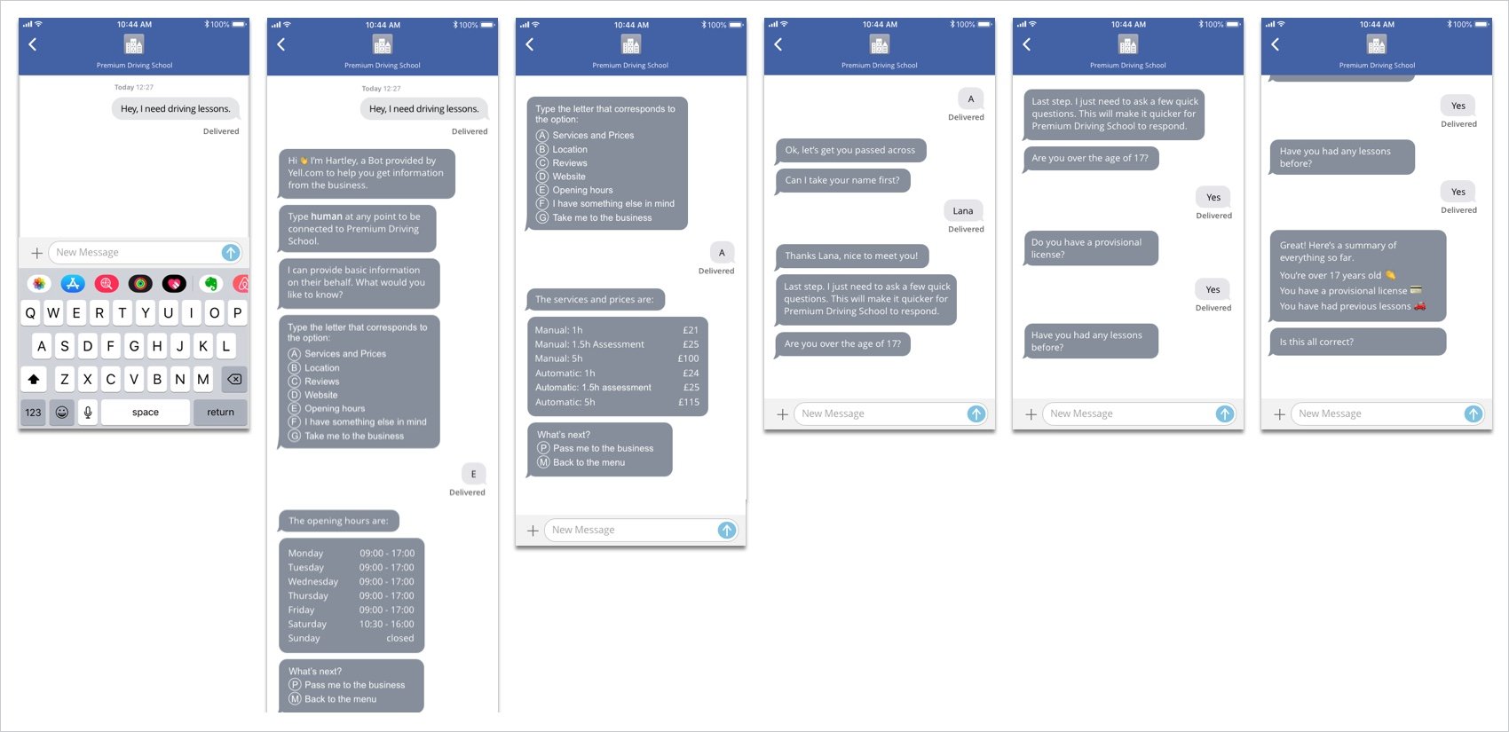
Designing the structure and taxonomy of the Chatbot’s language was highly important, but equally, as there are many facets to the user experience of a project, there were many questions to be asked with different stakeholders to ascertain it's identity.
1. Would it be male, female, non gender or another type of gender?
2. What should the tone of voice be like? Happy? Cheeky? Staid and informative? Corporate? Funny?
3. What should it look like? A robot? A person? A cartoon? A photo?
4. Should it have a name? Should the name be related to Yell?
5. What colour should it be? (With a company called Yell, well...)
The junior member of the team, who I happened to be mentoring, took to the task of designing the bot and in all our opinions did exceptionally well.

Chatbot designed by Viktorija Krajchevska
For our user testing sessions we decided to have 4 x 2 hour face to face discussion groups of two customer sessions with under 35's in one and over 35's in the other so we could see if age played a role in what they thought about the app and the offering. We also had 2 x SME owners for the merchant section of the app, across the ages.
Overall the app was received very well, highlighting in some areas we need to change/amend parts and in others that our hypothesis indeed was correct.
With enough information to put together an MVP, the app was first trialled in Manchester to a reduced number of people for testing purposes and shown to be highly successful in this period of social distancing and lockdown where businesses are looking to connect with their customers in new ways, proving it supports this brilliantly. It has been so popular that the whole Yell Messaging is now being rolled out nationwide.
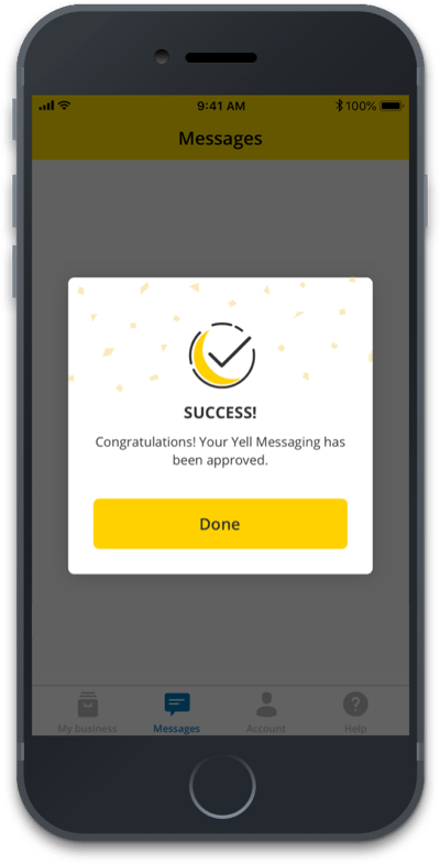
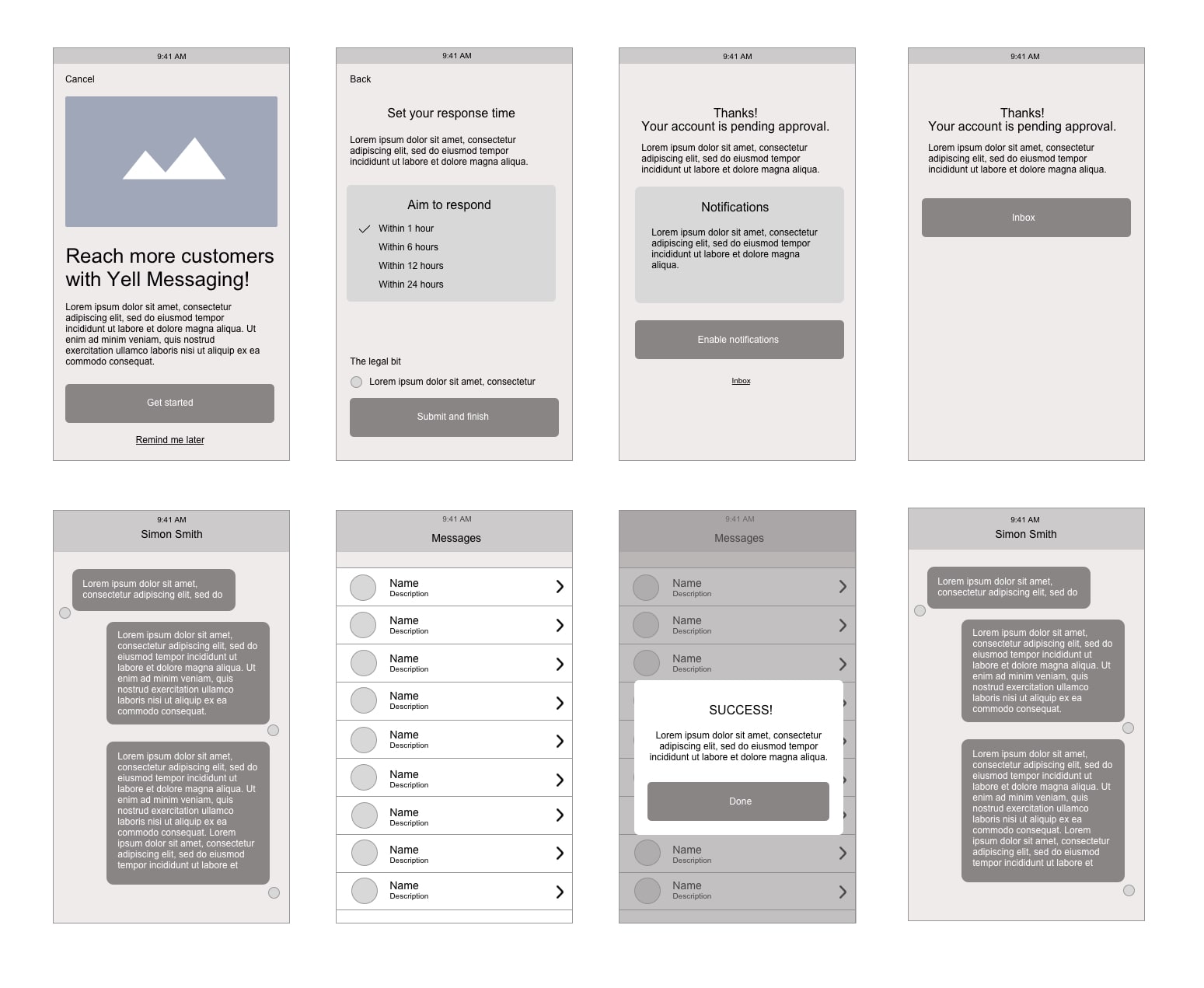
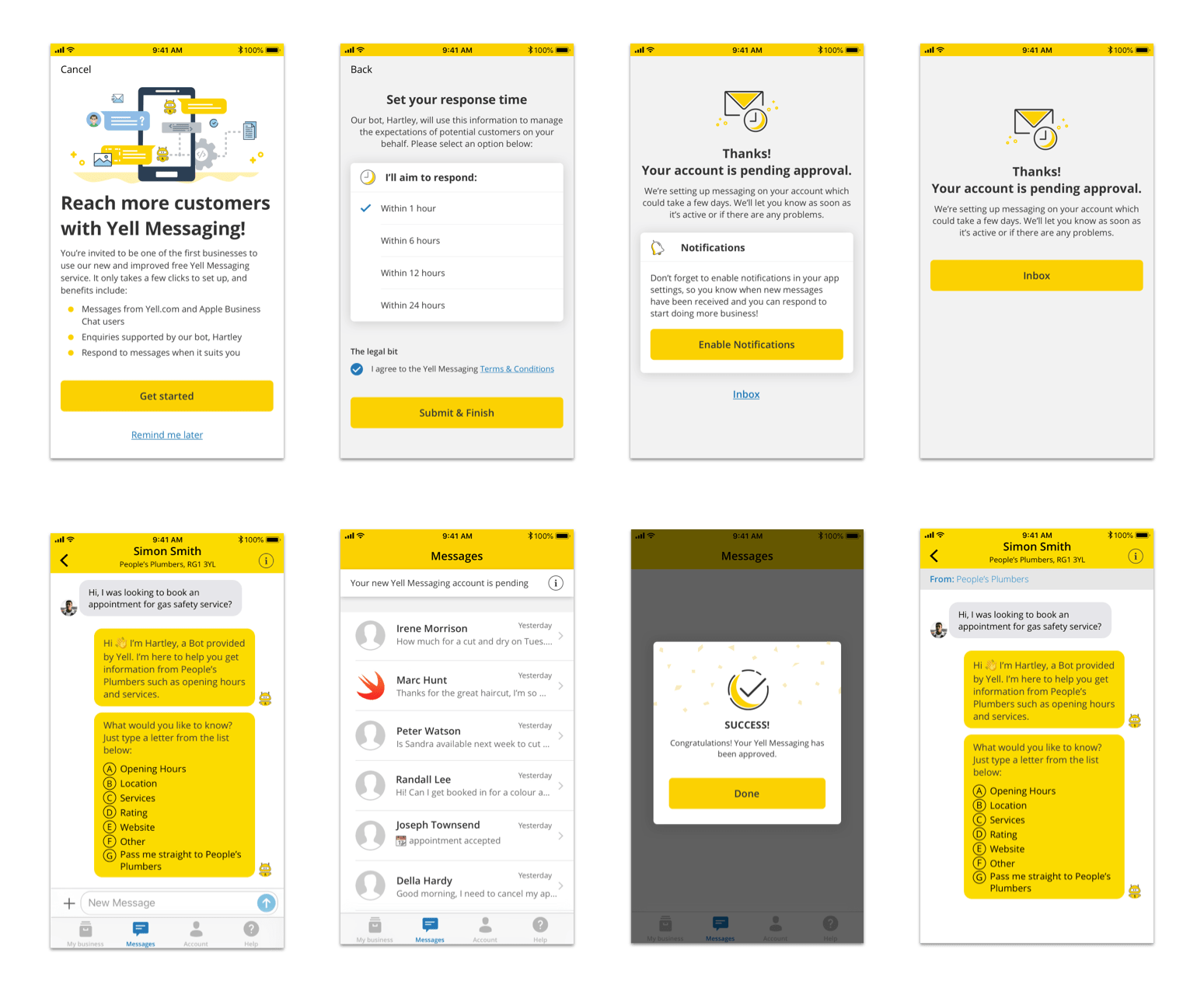
Designs produced by Viktorija Krajchevska