For confidentiality reasons I am unable to reveal data and analytical results for the metrics of the tests and findings below.
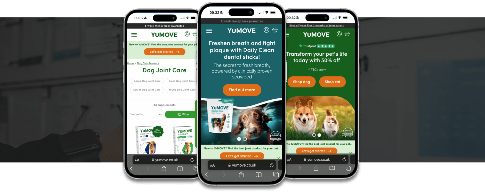
I led the UX/UI for YuMOVE the UK’s #1 veterniary joint supplement brand to expand its market share and increase online revenue.
Notable KPIS:
27% uplift in online conversions
25% increase in subscription revenue
Data capture boost increasing from less than 50 data points per week to over 4000 per week.
“Kai is an exceptional UX designer whom I had the pleasure of collaborating with during my time at YuMOVE. He played a pivotal role in shaping the user experience of the platform, contributing to the design of key features that are integral to YuMOVE's success today. Kai's creativity and innovation brought fresh ideas, enriching our product and enhancing its usability. I hope to work with Kai again in the future."
Mark Jackson - Product Owner - YuMOVE
I worked with multiple stakeholders, a development team, the marketing team, the analytics department and a CRO manager to improve each segment of the overall end-to-end ecommerce journey to create a seamless shopping experience, from initial touch points, to entering the site, conversion and uplift along the journey to streamlining the checkout process to redesigning content for Black Friday.
Working constantly with the analytics department and the CRO manager was important to gain insights and translate this data to address our customers behaviours and the business goals. On a bi-weekly process we would examine the data, hypothesize, create a test and then examine the results towards creating the perfect journey to satisfy our users needs.

To increase the sales/uplift/conversion in a market that is already swamped with pet products and improve onboarding and recommendation experience to drive the above and aid/increase data capture.
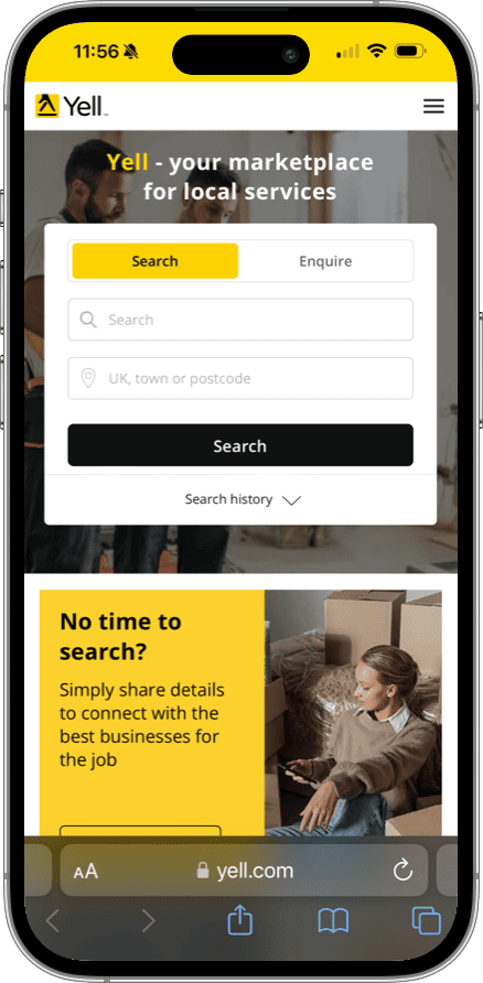
My experience of working on large ecommerce/search sites is quite extensive given that I led the UX at Travelodge for 18 months, led the UX for Yell on their website and apps for 3 contracts and also led the UX auditing at Penguin too for their new website.
The journey needs to be swift and simple on each step, easily navigable with no impediments enabling the user to find what they want and upselling along the journey to a pain free checkout process.
I wanted to break each section of the Yumove journey down into small chunks, focus on each part, analyse the data, test with the CRO team, design with the marketing team, increase conversion and uplift until the whole journey worked swiftly and effectively.
The areas I would mainly work on were:
For this case study I have provided thoughts, ideas and designs for the homepage banners, recommendation quiz, search filtering system and product page.
An ecommerce journey is only as good as its weakest link and so it’s important ensure every part of the journey works as smoothly as possible.
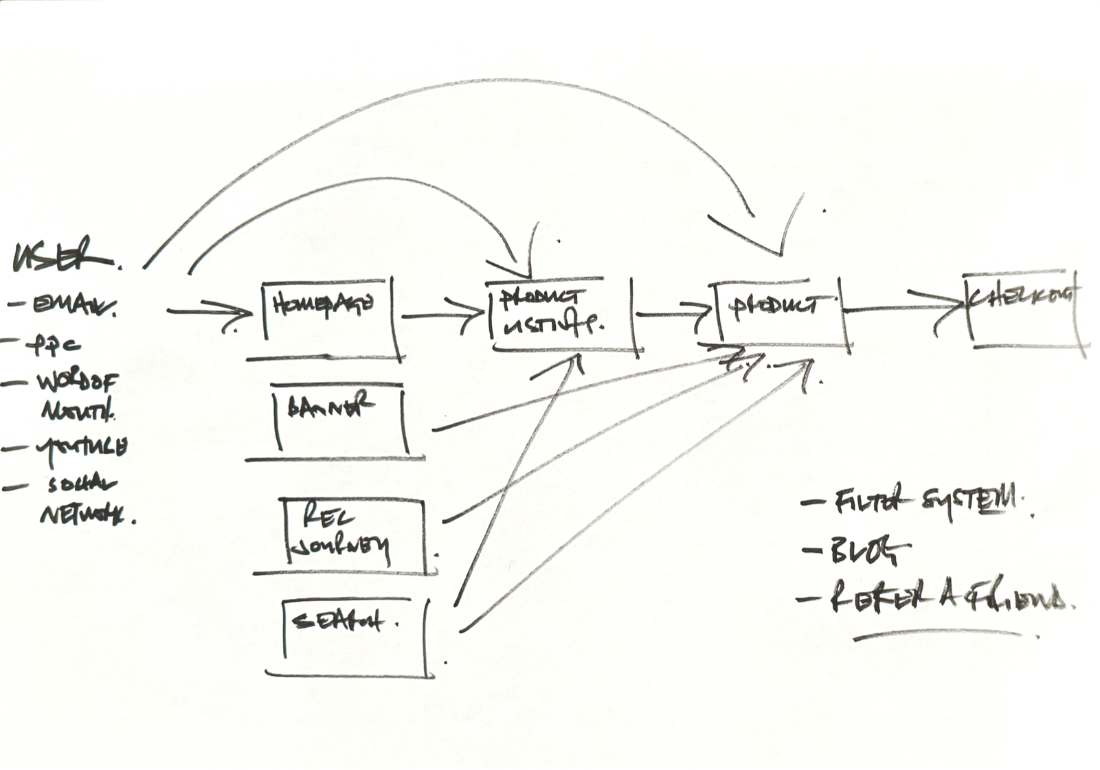
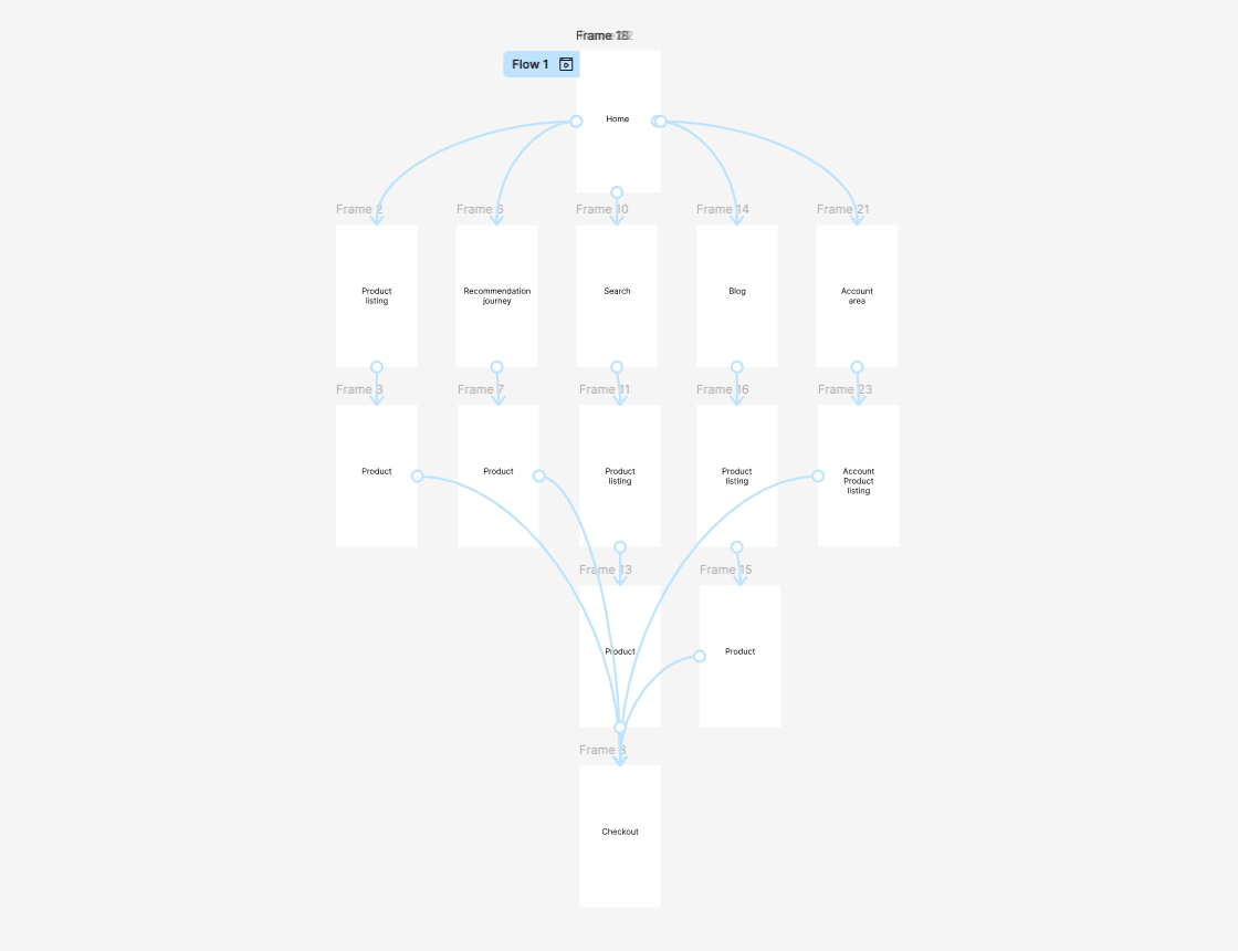
It was important to understand the user behaviour across the site, the different routes to the checkout and where they entered the site, from what touchpoints
Example of different routes across ecommerce landscape
It’s really important to establish certain criteria before designing a user experience that perfectly serves the user.
For me, it always begins with the user and business goals, competitor analysis and of course the audience.
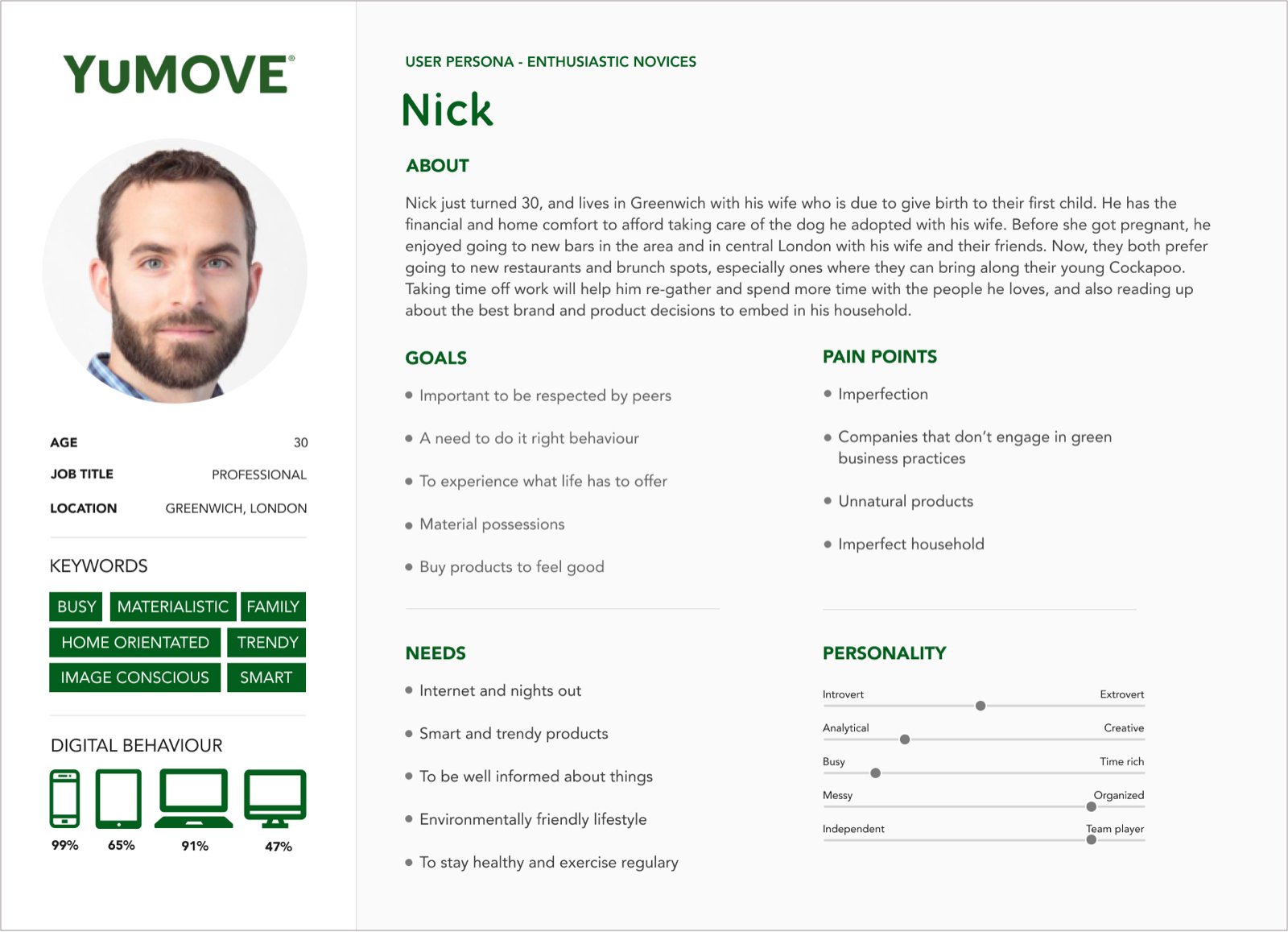
Personas once created become an excellent resource to constantly refer to throughout the creation of the product.
YuMOVE had conducted a huge amount of market research revealing great insight into their user groups enabling me to create 4 key personas.
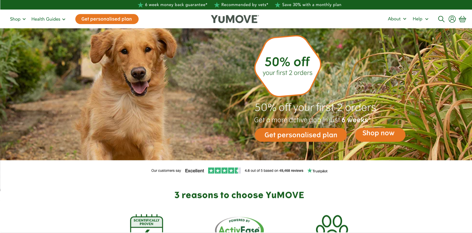
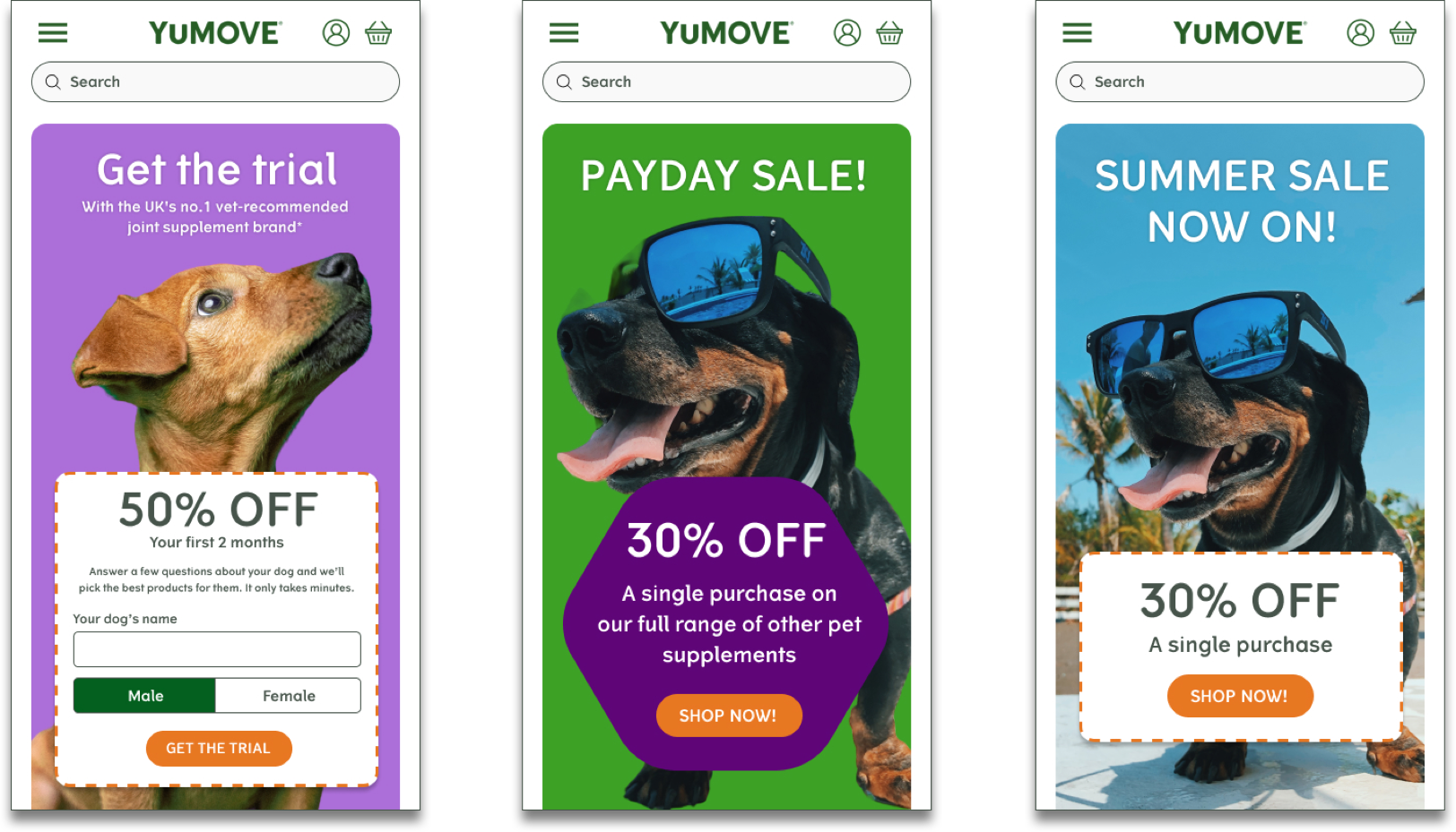
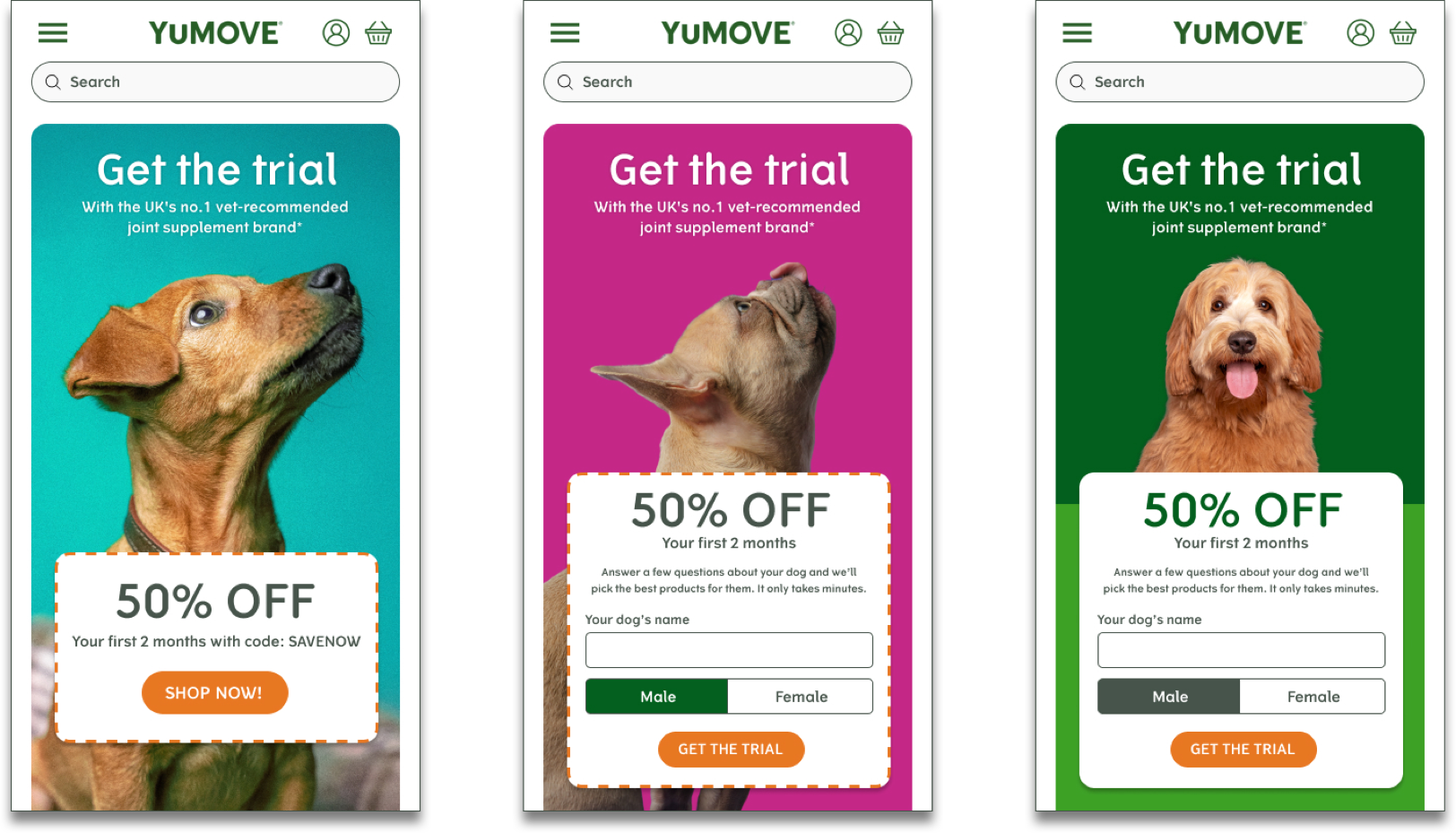
When I began at YuMOVE the homepage banner suffered a high bounce rate. It also displayed multiple messages and CTAs. There were two customers to appeal to: customers who wanted to ‘buy now’ or a subscription based model, and the importance between the two switched regularly.
I wanted to test multiple ideas. It was my assertion that the banner created in the user a cognitive overload. Too many messages presented on a busy background also created a legibility issue. The colours were too similar. The writing too small. Although I was never a fan of carousels, I thought we could test having the messages on two different banners and make the first banner always the one of importance as UX testing on carousels has proven to be the case.
I also wanted to test with a solid background, instead of a photo with a lots of different colours, so the messaging and CTA button would really stand out.
We monitored the analytics using Hotjar and Google Analytics to understand the user behaviour, see what they actually clicked or touched on depending on device usage. We also analysed our competitors and their approach.
The changes had an immediate effect and the bounce rate reduced considerably enabling users to move through the journey more informed and quicker. We continued to test new messages, new designs and new CTAs on a bi-weekly basis.
Below are some of the initial ideas.
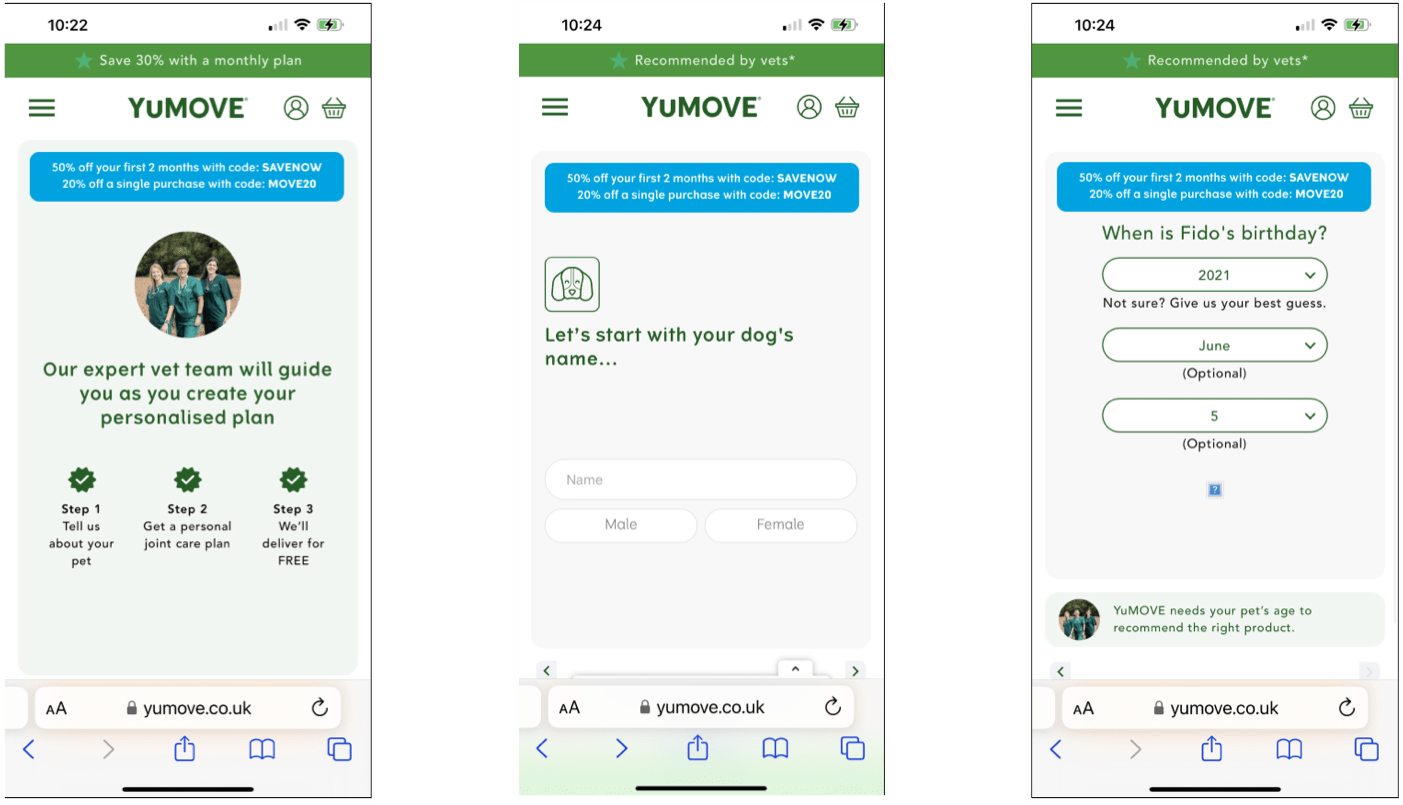
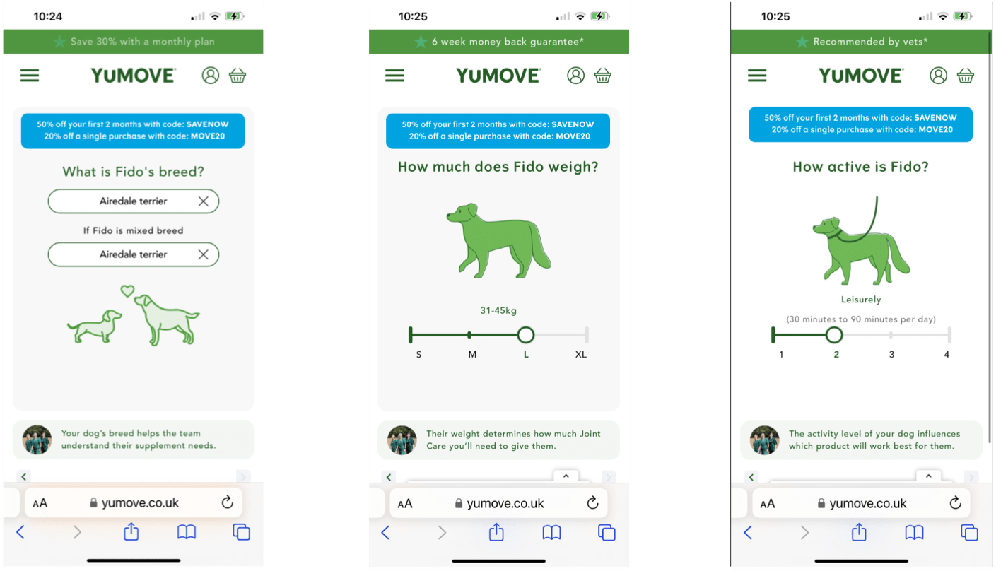
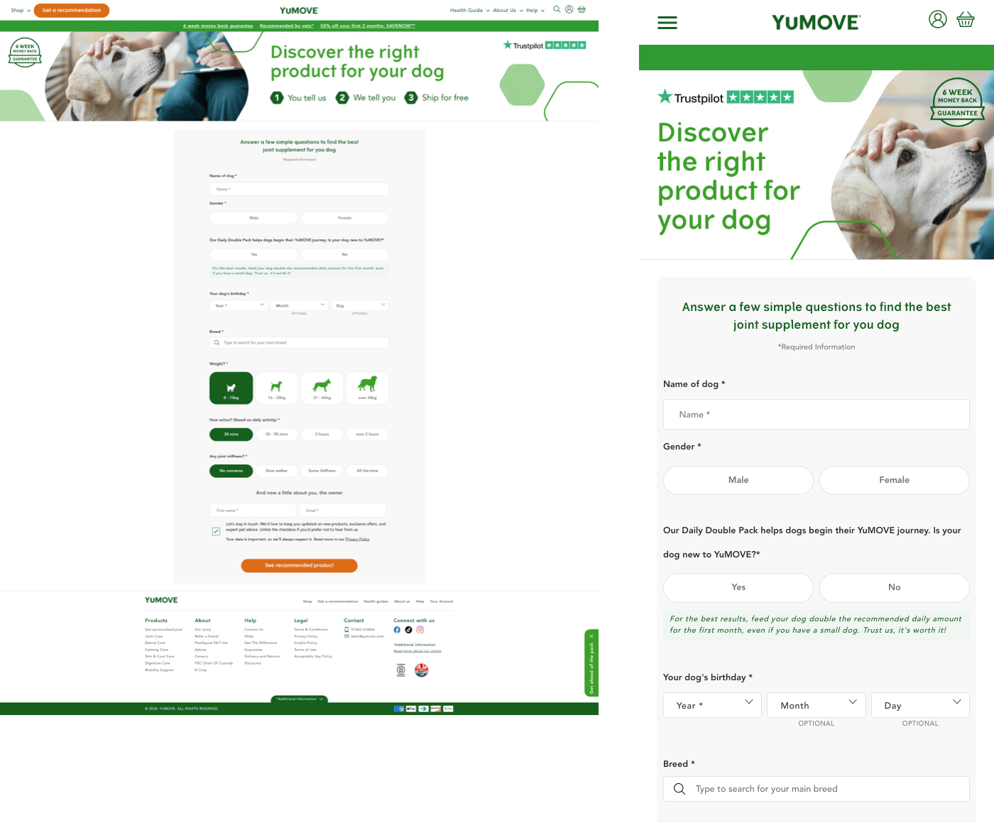
An important part of YuMOVE’s ecommerce journey is the recommendation quiz. It walks the user through a series of questions asking the name of the pet, birthday, breed and more.
While serving a function so the user can then be presented with a product that meets their pet’s needs , it also serves as an excellent data capturing exercise for YuMOVE to learn more about their users.
I could see immmediately it lacked a breadcrumb which given that there was 9 steps, it would be good practice for the user to have an understanding of the length of the journey to prevent them dropping off, as the analytics indicated. With each step a percentage of the users dropped out. Also the CTA, a red button at the bottom of each
page on a percentage of mobile devices was below the fold, leaving the users to figure it out, adding another impediment to the overall journey.
We decided to test a simpler reduced journey with less choice on just a single page. Our hyposthesis: the user would now understand the length of the journey and be more engaged to finish. We immediately saw a difference, a reduced bounce rate and higher completion of the form whilst also collecting important data.
We ran multiple CRO tests: the colour of the buttons, icons in buttons, different messaging in the header and constantly refined the journey.

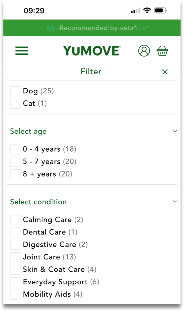
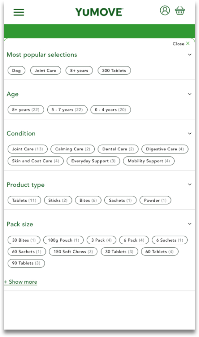
As with all search filtering systems, they serve to enable the user to find what they are looking for quicker. The initial problem with the old filter, particularly on mobile which had a much higher usage, was that it immediately closed after the first selection before allowing the user to add other refinements. This became incredibly frustrating as our testing indicated.
Analytics also displayed that the most popular selections ‘Dog’, ‘Joint Care’, ‘8+ years’ and ‘300 tablets’ were far more popular selections over any others. I also wasn’t keen on the tick boxes and wanted to test a simpler approach using buttons similar to how Airbnb displayed
long sets of questions to its users. By having buttons sat alongside one another rather than long lists of checkboxes we could also reduce the length of the filter pop up.
Adding the most popular selections to the top of the filter list had a huge effect. We were simply giving the user the ability to reach what they wanted quicker. This clearly showed the importance of analytics. As with all our tests, we carried on making refinements until the data indicated we had created a significant change and proved our hypothesis.
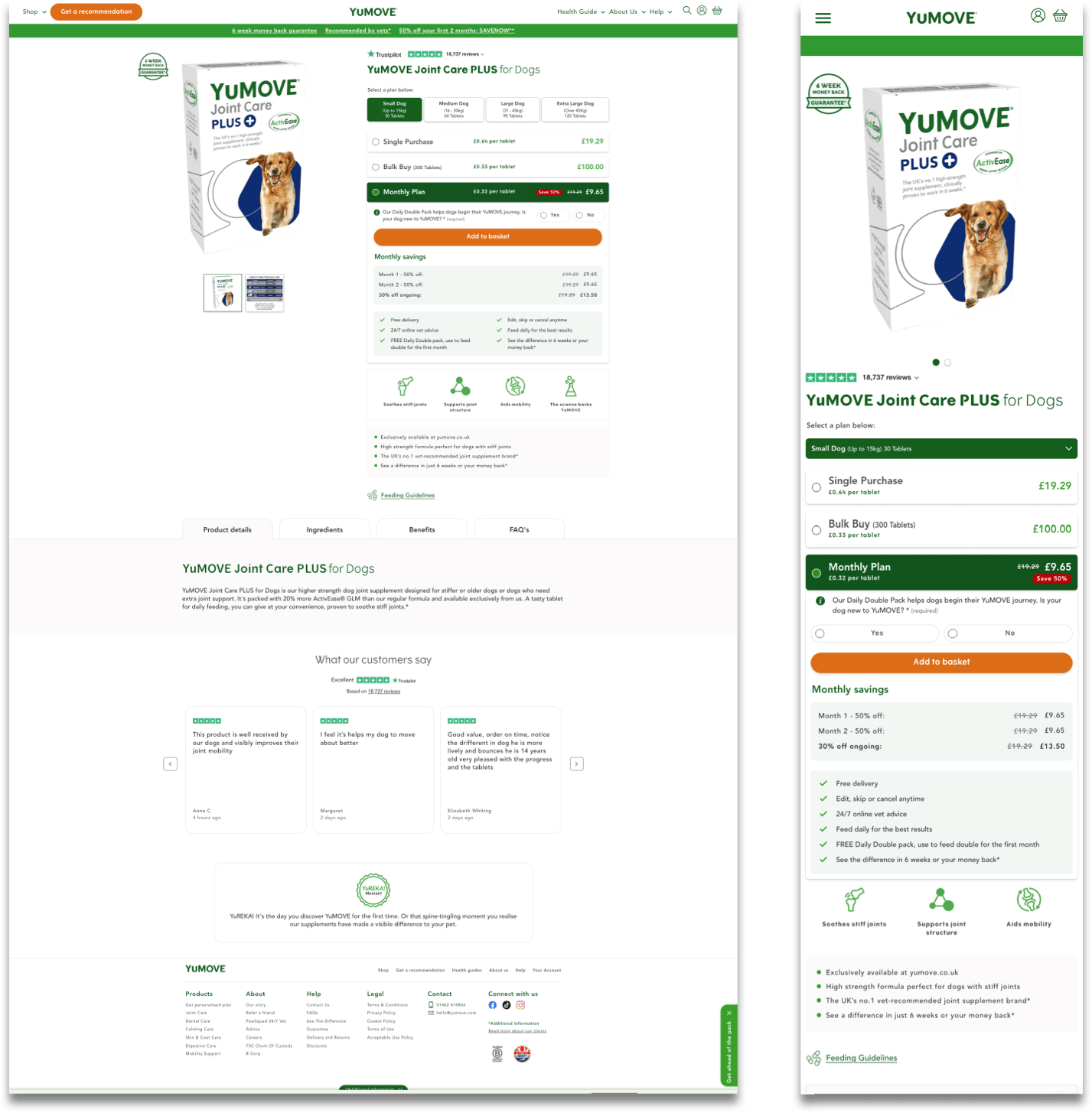
As with every eCommerce website the product page obviously ranks as one of the most important. There’s no point in having the perfect journey to the product page if when the user arrives they can’t learn about the product, understand its features, select different versions of it and more.
Initially the product page in my opinion had too many messages and the ability to finally make the purchase either on desktop was too far down the page or on mobile way below the fold. I also thought there was simply too much information for the user to read before the purchase could take place.
I like to create a story, a narrative when moving the user through each step of journey. Whether that be the overall site journey or the journey of each page.
I want to break each page into a series of steps that logically walks the user through to reach their goal and the goal of the business.
In the examples below of the older versions of the product page the user has a substantial amount of information to get through before finally ‘finalising plan’ or ‘adding to basket’ including the offering of a different product. On the ‘Subscription Model’ offer there are 9 different sections to read through before the CTA.
Our analytics displayed users were struggling here. There was clearly a cognitive overload at play.
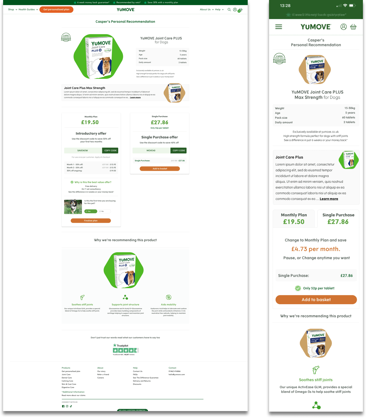
I wanted to test moving the CTA higher up the page and give the user a series of steps that would sequentially take them to it.
1. Start with a trustpilot icon and 5 stars to
install customer confidence immediately
2. Name of product
3. Selection of plan based on pet size
4. Single or Bulk buy or Monthly plan
5. The CTA
Underneath the 3 options a box would change to reveal the different information related to that choice. I could still see problems with this version, for there is an argument to have all the information for the
user to see to base their information on before the CTA, but I wanted to see if they were interested in it or just wanted to purchase. We knew through analytics there was a percentage of users that bought the single purchase every month and didn’t want to subscribe, so why put all the information in front them everytime?
There were many different questions and the only way to find out was to test.
Moving the CTA higher was definitely a good move and proved to increase users adding to the basket.
It is clear after using analytics to provide insight into the users behaviour, UX experience, lots of questioning, constant testing and reiteration that impactful results are achieveable.
By understanding the user and business goals, drawing up our personas and understanding the competition through competitor analysis we were able then to focus on what and how to test and redesign leading to a 27% uplift in online conversions, 25% increase in subscription revenue and see a data capture boost increasing from less than 50 data points per week to over 4000 per week.